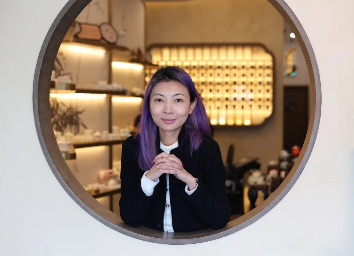
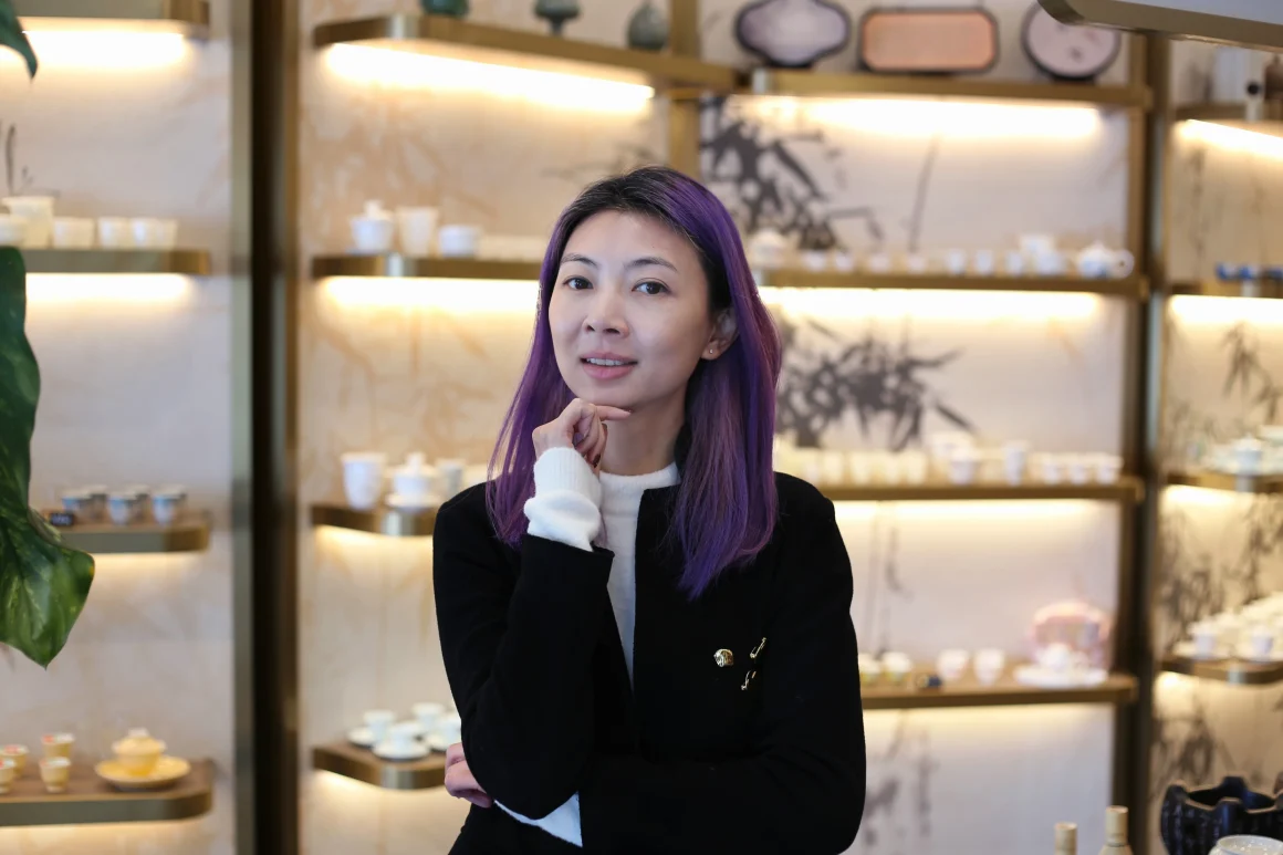
By Zoe Lee, Founder at Dexign Matter Studio
When I was 14, I was sketching an old opera house with my art tutor. That was the moment I realized a space can hold emotion the way a sponge holds water. I still carry that with me today.
I have worked across Guangdong, Shanghai, Singapore, and Canada, and I have seen the same truth in every market. People feel a space before they judge the product. They notice the mood first. They read the story very quickly.
If you are opening your first cafe, bakery, salon, or specialty shop, your interior has a serious job to do. It has to express your brand. It has to support your daily operations. It has to help people remember you. When it also makes them stop, take a photo, and share it, that gives your business even more power.

I always come back to one belief. A good design is the perfect solution to a problem. In retail and hospitality, that means your space has to look good, work hard, and help the business grow.
Instagrammable only matters when it supports the business
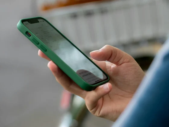
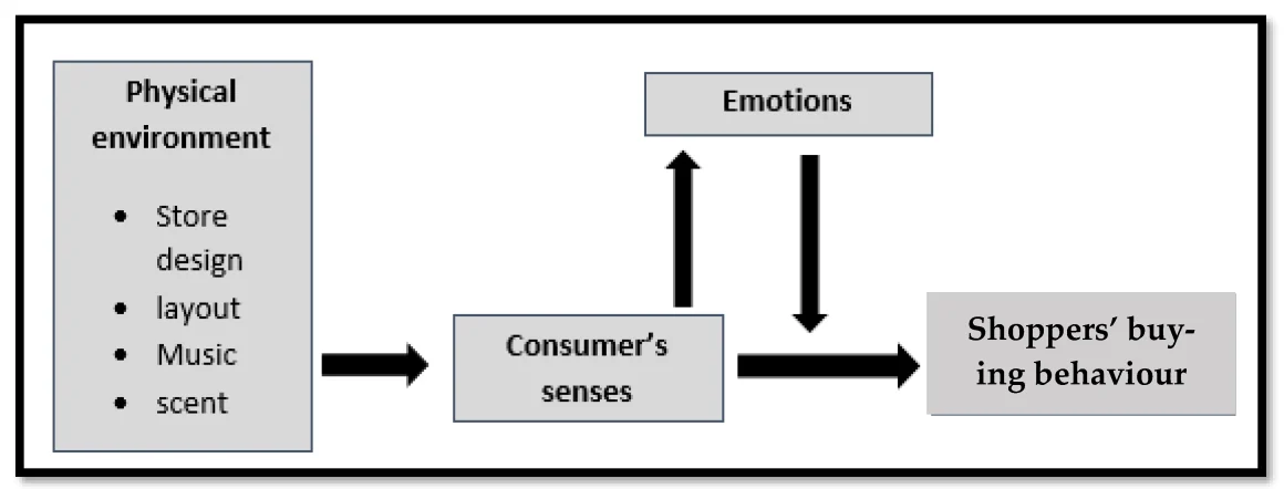
Many first-time founders come to me and say they want an Instagrammable space. I understand why. Research shows that 62% of consumers are more likely to purchase a product if they first see photos or videos posted by other customers. Social sharing influences buying.
The space also shapes how people judge your brand. Retail research shows that an interior influences customer perceptions of any brand. People read quality through materials, lighting, layout, and detail. They do this consciously and subconsciously.
This matters even more when your customer is younger and visually driven. In one UK study, people aged 18 to 34 were spending £419.6 million per month on live-event experiences. The same study points to millennials controlling $1.3 trillion in annual spending. They value experience. They value atmosphere. They want places that feel worth sharing.
So when you say you want an Instagrammable space, I hear something bigger. You want a space that creates attention, builds memory, and supports sales. That is a very smart goal.
Start with the spirit of the project
I enjoy curating spaces, dressing up walls and adding finishes, but I never start there. I start with the spirit of the project. This is the most important part of my process.
At Dexign Matter Studio, the conceptual development stage is where we unlock the design possibilities. This is where we establish the core narrative. I need to know what your brand stands for, what your customer should feel, and what kind of experience you want to create. Without that clarity, the design can become expensive noise.
A strong concept helps people understand the space quickly. In one survey, 81% of shoppers said a themed store design was more attractive than a non-themed layout. Here, theme does not mean costume. It means a clear point of view. It means the space has one voice.
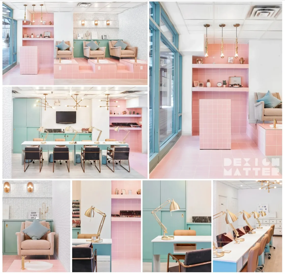
At The Cube Nail Lab, the concept came from the Rubik’s Cube. We proposed the name “The Cube,” then carried that idea into the logo, the tiled grid, the feature wall, and the reception counter. The project had a very tight budget and the client was starting their first business. A clear concept gave them identity right away. It also helped the space become naturally photo-friendly.
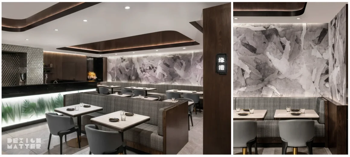
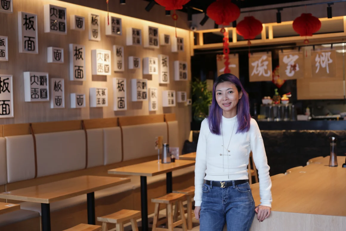
Yuan Chinese Cuisine followed a different path. The client wanted a modern Chinese fusion restaurant that would connect with a younger demographic. I drew from Chinese ink and wash painting, then translated that into a neutral grey and walnut palette, a monochromatic mural, and a custom black marble counter with a green leaf silhouette. The result felt modern, but it still carried cultural depth. The refreshed interior generated social media buzz and increased foot traffic.
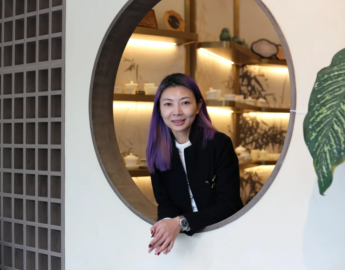
I grew up in Guang Dong, and now I live in Toronto. That background shaped how I see design. Culture leaves a mark on how we read color, material, and symbolism. In a city shaped by many cultures, people can feel when a space has real intention.
Design the whole customer journey
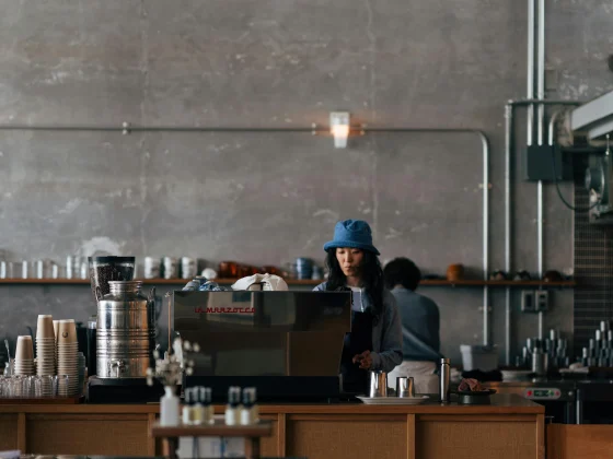
A lot of business owners focus on one photo wall. I look at the full journey. The storefront matters. The waiting area matters. The cashier, the display, the seating, and even the washroom matter. Customers experience your business as a sequence.
If the first five feet look strong and the rest of the space falls apart, people feel that break right away. The design loses its power. The brand starts to feel less believable.
H3 Matrix Restaurant & Bar is a good example of this. It was Toronto’s first space-themed entertainment concept, and it combined dining, bar, performance, and entertainment in one venue. The project had to support multiple functions at once, while keeping one clear identity. The meteor-shower entrance, the “Back to the Future” dining walls, the metallic bar, and the blue-lit details all belonged to the same story. That continuity helped turn the venue into a popular city destination.
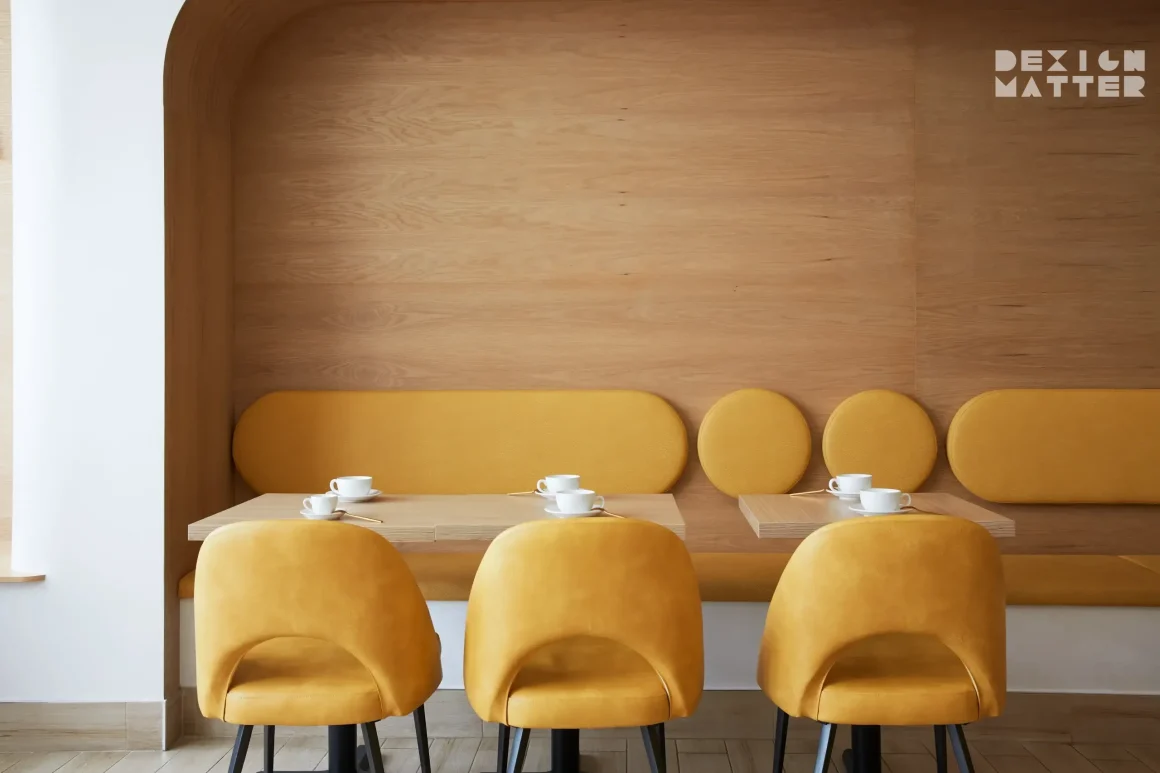
The same idea works in a smaller space. At Fuwa Fuwa Dessert Cafe, the curved booth seating, soft yellow upholstery, red oak, and glowing dessert counter all support one playful narrative inspired by Japanese souffle pancakes. Customers feel the brand before they sit down.
When the journey is cohesive, people relax into it. They stay longer. They notice more. They are more likely to share what they see. This is how interiors begin to support sales in a very practical way.
Give the space one strong hero moment
Every successful commercial space needs one memorable move. This is the detail that catches the eye quickly and gives people a reason to take out their phone.
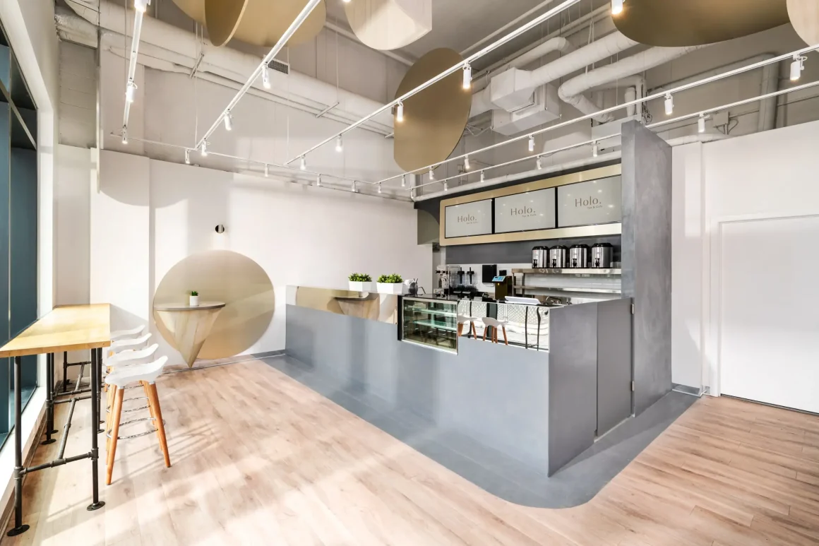
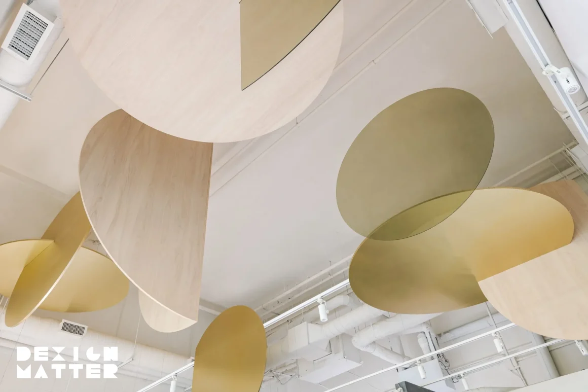
At Holo Tea & Cafe, the hero moment was the ceiling. Large interlocking discs in champagne metal, wood, and acrylic created movement and volume overhead. That sculptural feature became the signature image of the cafe. It gave the business a strong visual identity in a very competitive market.
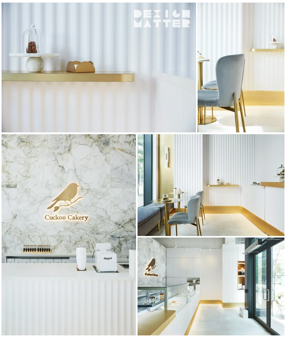
At Cuckoo Cakery, I used a wavy wall inspired by icing knife patterns. The gesture was distinctive, but still restrained. I wanted the cakes and pastries to remain the true heart of the space. That balance matters. The hero moment should support the product, not overpower it.
For first-time entrepreneurs, this point is very important. You do not need visual drama in every corner. One strong feature is often enough. When it is tied to the brand story and placed in the right area, it can carry the whole space.
Use materials, color, and light to create feeling
I love exploring the juxtaposition of materials, colors, forms and patterns. This is where design becomes expressive. This is also where the emotional power of a space really starts to build.
These choices affect mood more than many people realize. Research shows that 46% of shoppers said an appealing color scheme creates a positive mood. Same study found that 54% of consumers would not hesitate to enter a store with a luxurious design and atmosphere. People react to visual comfort. They react to richness. They react to harmony.
At Yuan Chinese Cuisine, black marble, walnut, neutral greys, and soft backlighting created warmth and sophistication. At Brewin Teaware, ink-wash bamboo wallpaper, softly lit metallic gold accents, and handmade wood details were used to slow people down and invite them to breathe.
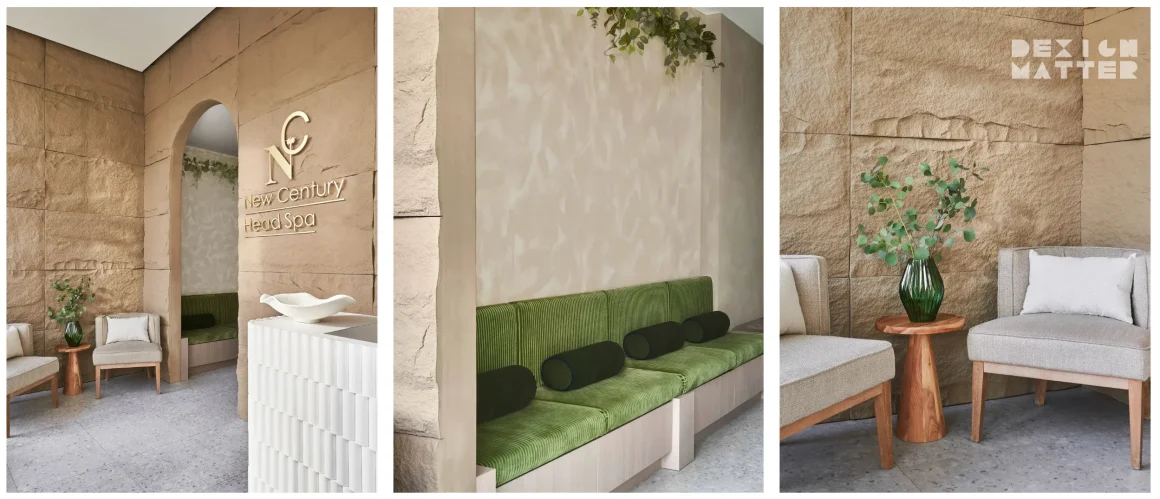
At New Century Head Spa, muted beiges, warm wood tones, textured plaster, and curved forms created a calm, immersive wellness experience.
Lighting is part of this story too. The right light gives depth to material. It shapes the mood. It helps products, food, and finishes read properly in person and in photos. A feature wall under poor lighting can disappear. A dessert counter under the wrong light can feel cold.
When I talk about creating a multi-layered, stimulating sensory experience, this is what I mean. Materials, color, and lighting should work together. Every space should sing & dance, but it needs rhythm and control.
Solve the operational puzzle early
This is the part many first-time founders underestimate. They focus on aesthetics first because that is the exciting part. I understand that. But sales begin in the floor plan.

Design is open ended. Sometimes it is about building a palette of finishes. Sometimes it means shifting walls, reworking circulation, or improving space efficiency. In commercial work, that problem-solving side is critical.
Research shows that about 25% of store sales can be attributed to the way products are designed and displayed. That is a major number. Layout and merchandising directly affect business performance.
Even simple visual cues can drive action. One study found that 42% of shoppers said sale signage led to unplanned purchases. So if your sightlines are blocked, your product display is weak, or your counter creates congestion, you are making sales harder than they need to be.
Cuckoo Cakery had only 700 square feet, still it needed production, sales, seating, and display. Every inch had to work. New Century Head Spa had to fit four private treatment rooms, six shampoo stations, reception, waiting, a foot spa, staff facilities, and an accessible washroom into 900 square feet. Those are very tight conditions. Strong space planning is what made both projects function well.
A beautiful space that frustrates staff or slows service will hurt the business. A well-planned space improves movement, comfort, and efficiency. Customers feel that immediately, even if they cannot explain why.
Keep branding and interiors connected
Many first-time entrepreneurs separate branding from interior design. I see them as one conversation. Your name, logo, signage, color palette, packaging, and space should all speak the same language.

This is especially important in the early stages of a business. Many of my clients are highly involved at the beginning, and I welcome that. Early brainstorming is where the project spirit shows up. Once we define the direction clearly, the design becomes much stronger.
The Cube Nail Lab is a clear example. We did not simply design a pink nail space. We built the concept from the brand itself, then extended it through the interior. The result felt cohesive, playful, and memorable.
Noodle Legend followed a similar pattern. We worked closely with the client on branding and positioning at the start. Once the brand direction was clear, the restaurant could stand out as a destination rather than blend in with the typical noodle shop around it. For a new business, that kind of clarity has real value.
Spend with intention
People often assume that an Instagrammable space has to be expensive. I do not see it that way. Good design comes from smart decisions, clear priorities, and careful detailing.
I usually advise clients to invest in the places customers notice first and remember most. That often means the storefront, the reception or cashier counter, a signature feature, key lighting, and the strongest display moments. Those areas shape the first impression and the photo memory.
Cuckoo Cakery is a good example of how to do this well. The original wavy wall product was costly and had to be shipped from the U.S. We redesigned it in-house and had it CNC-cut locally, which reduced the cost by nearly half. The space kept its signature feature and the client stayed in control of the budget.
At The Cube Nail Lab, the budget was very limited, so we prioritized the branded moments that would carry the most visual impact. At Noodle Legend Richmond Hill, coordinating custom production from China helped achieve 30 to 40% cost savings while maintaining quality. At H3 Matrix, overseas sourcing also helped manage cost without losing the effect the client wanted.
Budget discipline is part of design. I love concept design and the freedom it brings, but real projects always have limits. Working creatively within those limits is where strong design proves itself.
Protect the concept during execution
A beautiful rendering is only the beginning. If the idea is not protected through drawings, details, scheduling, and construction coordination, it can lose strength very quickly.
At Dexign Matter Studio, I work through a five-phase process. It begins with the initial brief, moves into schematic design and design development, then into construction documentation and construction coordination. Every stage matters. I give equal importance to each one because the end result depends on all of them.
We also use a custom in-house drawing system to streamline documentation and reduce turnaround time. For a first-time founder paying rent on an unopened space, speed and clarity matter a lot.
Yuan Chinese Cuisine was completed during COVID, so timing was a major challenge. Materials, fixtures, and furniture were sourced early to reduce delays. Holo Tea & Cafe required very precise detailing because of the large suspended ceiling elements. H3 Matrix needed detailed production schedules and close coordination across multiple specialized trades. This is the side of design people do not always see, but it is what gets the project built properly.
Let the space market itself
When the concept is clear and the experience feels strong, customers will often market the space for you. That kind of visibility is powerful because it feels genuine.
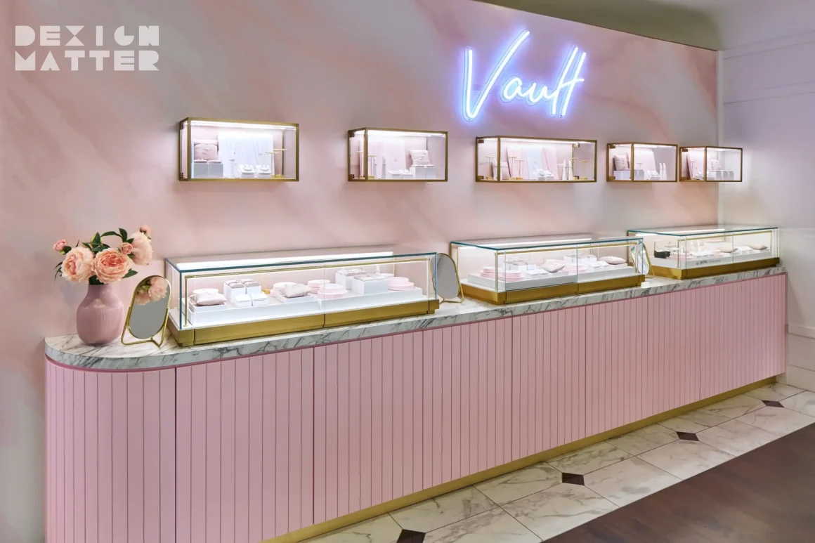
I have seen this happen many times. At The Cube Nail Lab, clients naturally took photos in front of the feature wall and pink tiled reception. Yuan Chinese Cuisine generated social media buzz after the redesign. Holo Tea & Cafe created a memorable image through its sculptural ceiling. Charmed Aroma’s “Vault” jewelry corner drew customer attention strongly enough that the concept was later developed for additional locations.
This kind of response does not come from random decoration. It comes from a space that has a clear idea, strong continuity, and an emotional hook. People share what feels memorable.
Measure what really matters
I do not measure success by style alone. I look at the end result. Did the design solve the problem on hand? Did it support the client’s goals? Did it improve the customer experience? Did it help the business stand out?
The strongest projects create results you can feel. H3 Matrix became a popular destination in the city. Noodle Legend attracted strong customer interest quickly. Charmed Aroma’s Vault helped drive jewelry sales and proved the shop-in-shop idea. Those outcomes tell me the design is working in real life.
If you are opening your first physical business, keep your focus clear. Build a concept with a real story behind it. Plan the layout carefully. Create one memorable feature. Use materials and lighting to shape emotion. Spend with discipline. Then carry the idea all the way through construction without losing it.
I believe great designs change the way how people live, dine, play, love and even change the world we live in. In retail and hospitality, that change can begin with one well-designed space that people remember the moment they walk in. When that happens, your interior starts working as hard as you do.
FAQs
How do I make a tiny 700-square-foot commercial space Instagrammable without creating clutter?
I always say sales begin in the floor plan. In tight footprints, do not decorate every wall. Choose one hero moment, like a custom architectural seating nook, and keep the rest minimal. Clean sightlines make your signature feature stand out more in photos and dramatically improve your daily staff operations.
Can a very low startup budget still produce a luxurious, shareable interior?
Yes. Luxury is about visual harmony, not just expensive materials. Research shows 54% of consumers are drawn to luxurious atmospheres. We achieve this on strict budgets by using an appealing color scheme and clever local CNC fabrication to mimic high-end, bespoke architectural details where it counts most.
What lighting strategy works best for generating organic social media photos?
The right light shapes the mood and the photo. Avoid harsh, direct overhead lights that cast ugly shadows. Instead, use soft backlighting, warm diffused pendants, and layered ambient light. This creates the visual comfort people react to, ensuring your food, products, and customers look beautiful both in person and on camera.
How do we encourage user-generated content without relying on generic neon photo signs?
Build the photo opportunity directly into the customer journey. Millennials command $1.3 trillion in spending and value authentic experiences over forced photo props. A striking product display, a wavy feature wall, or a unique tiled floor will naturally prompt photos because it feels like a genuine discovery.
How do I design a themed experience that attracts customers but avoids looking tacky?
Theme does not mean costume. It means a clear point of view. A study notes 81% of shoppers prefer themed designs. To avoid looking tacky, abstract the concept. Use cohesive color palettes, customized geometric shapes, and thoughtful material juxtapositions to tell your brand story subtly and elegantly.
About the Author

Zoe Lee is the founder of Dexign Matter Studio, an award-winning Toronto interior design firm. With over two decades of experience across North America and Asia, she takes a story-led, detail-driven approach, blending contemporary and organic elements into refined, emotive spaces. She has collaborated with global firms on iconic restaurants, luxury hotels, and residences, each reflecting a pursuit of beauty, balance, and meaning.